Case Study: Placement Management System
A mobile application designed to streamline the campus placement process, providing a centralized and efficient channel for students to discover opportunities and track their progress.
The Problem
For students in campus placements, generic job portals create inefficiency. Key problems identified were:
- Information Overload: Noisy global platforms force students to sift through irrelevant job listings.
- Application Uncertainty: A lack of transparent tracking creates anxiety about application status.
- Missed Opportunities: Critical announcements are scattered, making it easy to miss vital information.
User Research
To ground the project in real user needs, I conducted qualitative and quantitative research to understand the frustrations and goals of students navigating the placement process.
Target Audience
The primary users are final-year undergraduate and postgraduate students actively participating in their college's official placement drives.
User Interviews
I conducted semi-structured interviews with students from different academic backgrounds to capture a wide range of experiences and pain points. The goal was to understand their day-to-day process, their emotional state, and their unmet needs.
Interview with Vetrivel
The Ambitious Coder
"It's a mess. I check the college website, but it's slow. I scroll through LinkedIn, but 99% of it isn't relevant to my campus drive. Plus, I have to constantly monitor two different WhatsApp groups and my email. I'm always worried I'll miss something important from a top company."
"Definitely filtering. I see a company name I like, but then I have to dig through a PDF to see if I even meet the CGPA and branch criteria. It feels like I waste an hour every day just figuring out what I *can* apply to. I just want to see what I'm eligible for and apply."
Interview with Keerthivarman
The Anxious Core Engineer
"Finding anything for Mechanical. Honestly, it feels like every single notification and email is for a software role. I get excited when I see a notification, but it's never for my branch. It's really demoralizing and makes me feel like there are no opportunities for me."
"Like I've sent it into a black hole. I have absolutely no idea if they've seen it, if I've been rejected, or if I'm still in the running. The waiting and not knowing is the absolute worst part. A simple 'In Review' or 'Shortlisted' status would change everything."
Interview with Prathap
The Overwhelmed High-Achiever
"I try my best with a spreadsheet, but it's nearly impossible to maintain. Information comes from everywhere—a PDF in one group, a link in an email, a notice on the website... I'm constantly paranoid that I've missed a revised deadline or a critical pre-placement talk announcement. It feels chaotic."
"I just wish there was one app. One official place where the placement officer posts everything, and it sends me a notification for things that actually matter to me. That alone would reduce my stress by 90%."
Survey Findings
To validate the interview findings, a survey was distributed to 50+ final-year students. The quantitative data strongly supported the qualitative insights, highlighting three key areas of opportunity.
Primary Frustration
- 45% - Scattered Information
- 35% - No Application Tracking
- 20% - Finding Eligible Jobs
"On a scale of 5, how difficult is the process?"
User Personas
Based on the combined research, four distinct user personas were created to represent the diverse needs of the student body.
Vetrivel
The Ambitious Coder
Goals
- Secure a high-paying SDE job.
- Stay organized with applications.
Frustrations
- Wasting time on irrelevant listings.
- Fear of missing a top company's drive.
Keerthivarman
The Anxious Core Engineer
Goals
- Find jobs relevant to Mechanical Eng.
- Understand eligibility criteria clearly.
Frustrations
- All jobs seem to be for IT/CS.
- Uncertainty about his application status.
Prathap
The Overwhelmed High-Achiever
Goals
- Manage multiple applications efficiently.
- Never miss an announcement or deadline.
Frustrations
- Information is scattered everywhere.
- The process feels chaotic and stressful.
Perumal Rishi
The Ambitious MBA Candidate
Goals
- Find management trainee roles.
- Research company culture and growth.
Frustrations
- Lack of detailed company info.
- Generic job descriptions are unhelpful.
Ideation & Strategy
Process Flow Diagram
I mapped out the primary user journey to ensure a logical and frictionless experience.
Information Architecture
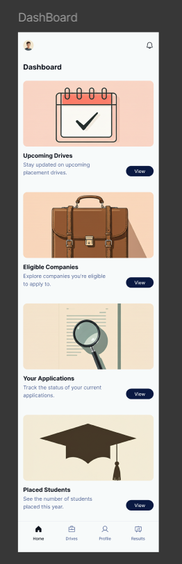
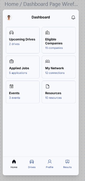
The app's structure was designed to be simple and intuitive, allowing users to access key information with minimal taps.
- Upcoming Drives
- Eligible Companies
- All Drives List
- Drive Details
- Application Status
- Personal Details
- Resume / CV
The Solution: UI Design
The final UI was designed in Figma with a focus on creating a clean, professional, and trustworthy aesthetic that reduces stress and allows students to find information quickly.
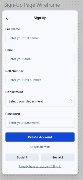
Wireframes
Before moving to high-fidelity visual design, I created a series of wireframes to map out the core structure, layout, and user flow of the application. This foundational step ensured that the user experience was logical and intuitive before any visual elements were applied.
High-Fidelity Prototype
With the structure defined, I developed a high-fidelity prototype. This phase translated the wireframes into a polished, visually consistent design that reflects the final product. Each screen was crafted to be clean, intuitive, and aligned with the project's goal of reducing student stress.
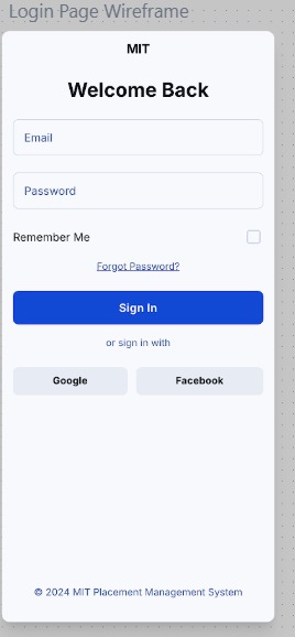
Mobile: Login
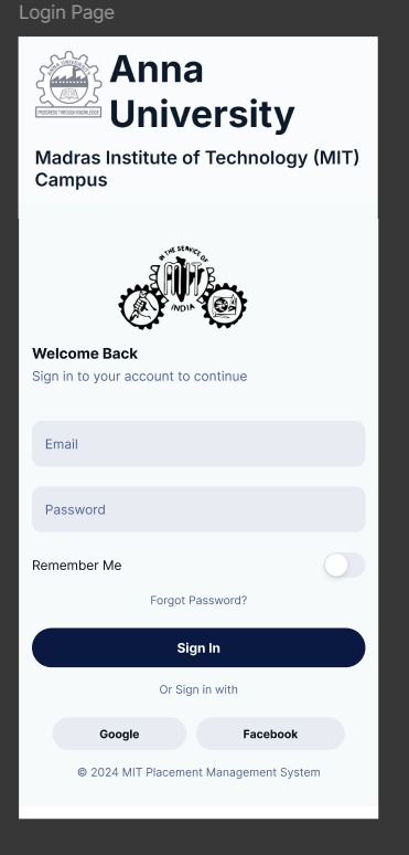
Applied Law of Common Region
The login form, social sign-in buttons, and branding are grouped within clear visual regions. This helps users quickly understand the page structure and focus on the primary task of signing in without distraction.
Mobile: User Profile
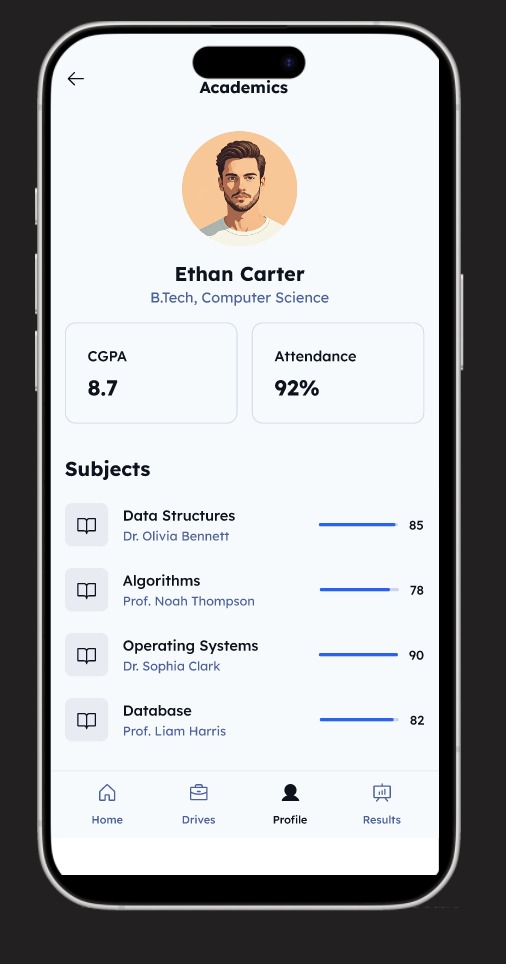
Applied Law of Proximity
Key academic stats like CGPA and Attendance are grouped closely together. Similarly, each subject is a self-contained unit with its name, professor, and score. This proximity creates logical connections and makes the data easy to scan.
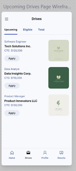
Mobile: Placements Feed
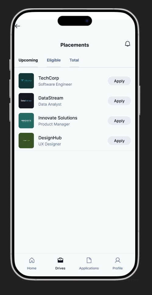
Applied Miller's Law
The screen presents job listings in a simple, digestible list. By showing only essential information (role, company, apply button) and using tabs for filtering, we avoid overwhelming the user, respecting the cognitive limit of holding 7 (+/- 2) items in working memory.
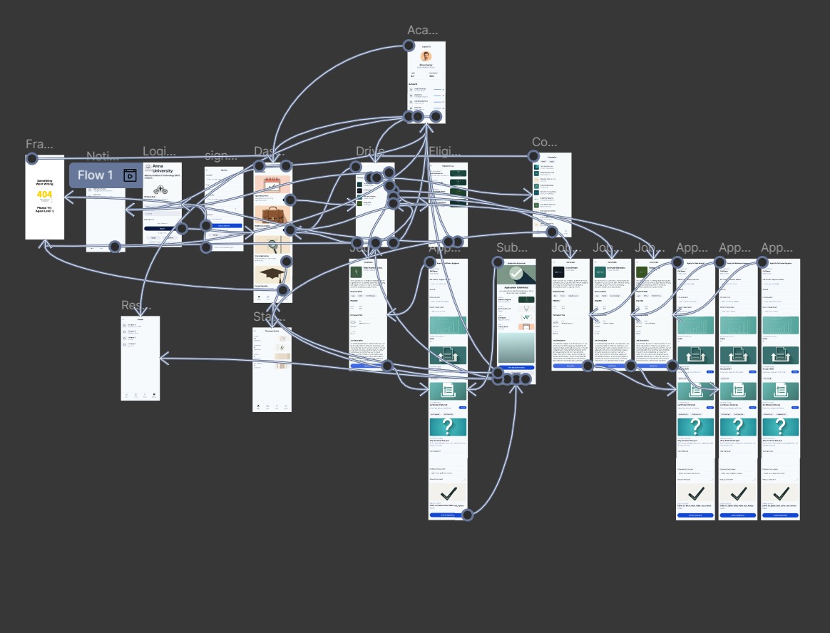
User Flow & Wiring
With the high-fidelity screens designed, I mapped out the complete user flow, connecting every screen and interaction. This detailed wiring diagram served as the blueprint for the final product, ensuring every user path was logical and accounted for.